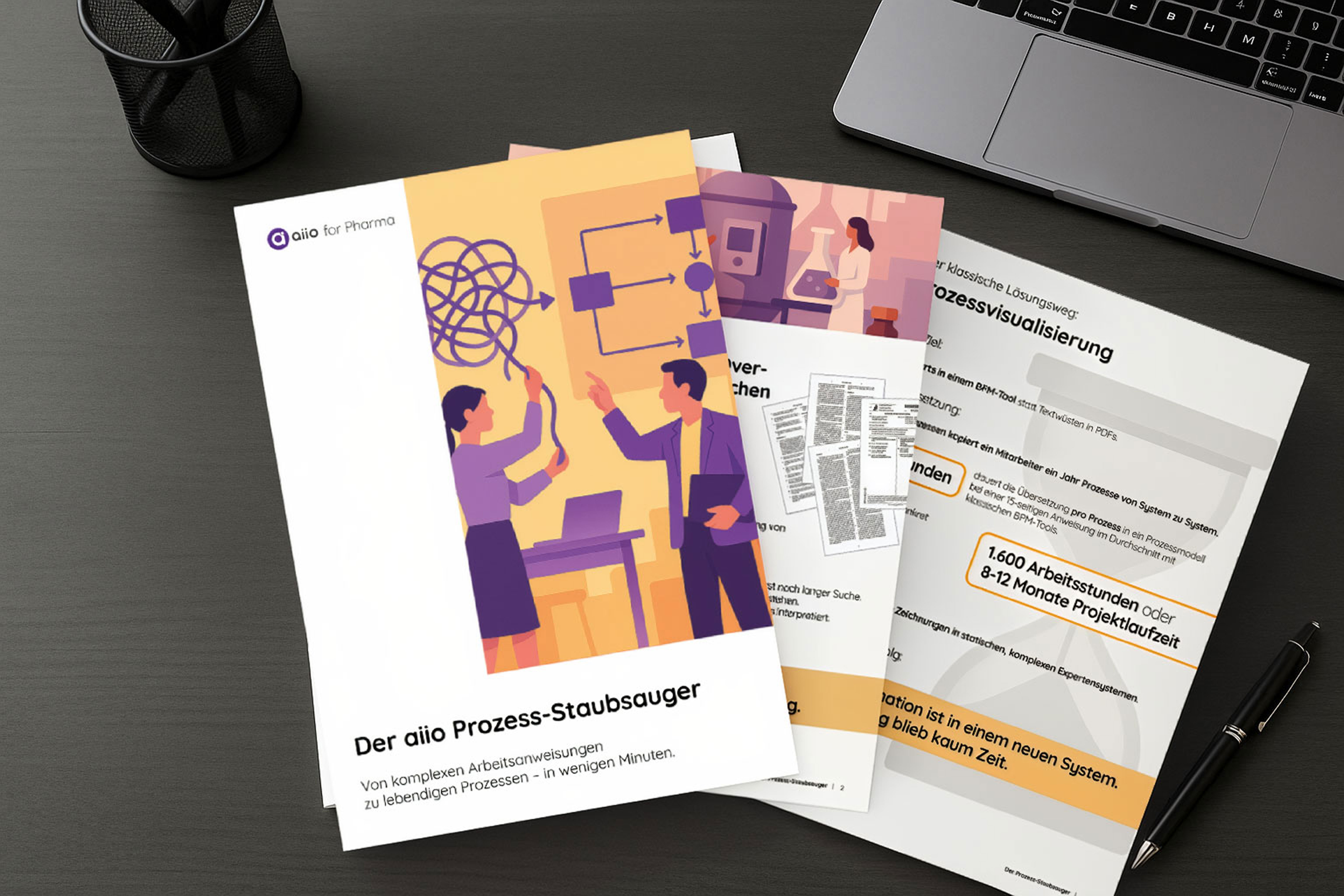
A strategic rebranding proposal for aiio, an enterprise process management platform repositioning from a BPM tool into an Agentic Process Intelligence Platform. Developed during my GTM work at aiio — full strategic foundation from SWOT through positioning, brand essence, archetype, identity direction and exemplary application.
The Challenge
aiio is repositioning from a traditional BPM tool to an Agentic Process Intelligence Platform — a strategic shift that places the company in an emerging, undefined category alongside agentic AI players. The current brand identity didn't reflect the new positioning. The purple-heavy palette, early-stage AI typography and futuristic-technical visual language belonged to a previous chapter — complex, busy, generic to AI software at large, and lacking emotional differentiation in an increasingly crowded process automation market.
The challenge of this project: rebuild aiio's brand from strategy outwards — define what the new category means for the brand, find a visual and verbal identity that signals clarity that thinks rather than more AI noise, and prepare the company to enter a new market position with the brand equity to back it up.
My Approach
I started where rebrands fail when skipped: at strategy, not aesthetics. A full SWOT analysis to map the competitive position, a brand positioning statement anchored on agentic process intelligence as a unifying claim, and a brand essence onion building outward from a single proposition: Clarity that thinks. The archetype work landed on The Sage as primary, The Magician as secondary — knowledge and clarity as the brand's core role, transformation as its operational promise.
From this foundation, the identity work followed strategy in connected layers. A moodboard contrasting legacy (early-stage AI, purple, complex, futuristic) against future (modern, minimalist, human-centric, calm) made the visual shift legible at a glance. Three colour palette iterations explored the territory — from a softer evolution of the existing purples, through a monochromatic aqua/turquoise system, to a hope-coded green palette. Typography moved from Outfit/Quicksand to a Futura/Graphik Fine pairing — more confident, more grown-up, more aligned with The Sage. Identity decisions were tested through exemplary applications across website iterations and trade-fair stand concepts, so the brand was evaluated in the contexts it would actually have to live in.
Results & Outcome
A complete strategic and visual rebranding proposal, delivered as a presentation that takes aiio from category definition through to applied identity in real-world contexts. The deliverable includes positioning, archetype, brand essence, three palette directions with full hex/RGB values, a revised type system, logo direction with sketches, and exemplary applications across website and trade-fair stand mockups.
What this delivered for aiio: a decision-ready framework for the brand evolution accompanying their repositioning from BPM tool to Agentic Process Intelligence Platform. The work consolidates strategy and identity into one coherent argument — the kind of foundation a GTM team can build messaging, sales material and external communication on, without the strategy and design layers contradicting each other six months in.
Services Delivered
A B2B SaaS company entering a new market category. A brand still wearing the clothes of the previous one.
aiio is an enterprise process management platform — a system that helps organisations document, structure and continuously improve their workflows. Until recently, that meant transparent process maps, compliance support, certifications, and a centralised source of truth for how work actually gets done. Useful, defensible, traditional BPM territory. Then the product evolved. With the introduction of Process Forge and the broader move toward agentic AI, aiio is repositioning into a new and still-undefined category: Agentic Process Intelligence. A platform that doesn't just analyse processes or just automate them, but turns them into self-improving workflows.
The product moved. The brand hadn't. This case study walks through the strategic rebranding proposal I developed during my GTM work at aiio — the strategy that gives the new positioning a foundation, the visual direction that makes it legible, and the applied identity that lets a stakeholder actually picture what the new aiio could look like in the world.
The product team had done the heavy lifting on category. Agentic Process Intelligence is a real strategic claim — it combines process mining, automation and LLM agents into a single orchestrated system, and it is genuinely different from what the major incumbents are offering. The problem was that none of that strategic ambition was visible in the brand. The purple-heavy palette, the early-stage AI typography, the futuristic-technical illustration language — these belonged to the chapter aiio was leaving, not the one it was entering.
The brief I wrote back to myself was specific: build a brand foundation strong enough to carry a category claim. Not a logo refresh. A strategic argument, expressed visually, that gives the GTM team something coherent to sell, the sales team something legible to point at, and the company a brand position that doesn't undercut the product position at the most visible touchpoint.
There were three real obstacles to acknowledge upfront. Lower brand awareness in a crowded market — aiio competes against well-funded process mining and automation players with established visibility. A complex value proposition requiring storytelling — agentic process intelligence is not self-explanatory, which means the brand has to do a lot of communicative work before the product even gets a chance. And limited emotional differentiation versus legacy tools — the previous brand was technically competent but emotionally generic, indistinguishable from a dozen other AI dashboards.
The rebranding had to address all three.
Rebrands fail when they start at aesthetics. I started at strategy and let the visual work follow.
SWOT analysis. The first piece of work was mapping the actual competitive position. The strengths are real and underleveraged: a proprietary agentic approach combining process mining, automation and LLM agents; strong consulting-partner relationships; a modular, enterprise-ready platform; clear focus on decision-makers and measurable outcomes. The weaknesses are the brand's, not the product's: low awareness, complex value proposition, weak emotional differentiation. Opportunities sit in the category itself — executive demand for intelligent automation is rising, frustration with siloed tools is creating appetite for unified ecosystems, and agentic AI is genuinely a new category being defined right now. The threats are the speed of the AI landscape and the size of the incumbents moving into the same space.
This wasn't strategy theatre. The SWOT became the brief for everything that followed.
Brand positioning statement. The positioning statement is the sentence the rest of the brand has to defend:
For transformation-driven organisations and decision-makers, aiio is the Agentic Process Intelligence Platform that turns untapped operational complexity into actionable clarity and automated execution, because it unifies process insights, decision logic and AI agents into one orchestrated system. Unlike tools that only analyse or only automate, aiio transforms processes into self-improving workflows.
The structure does work: it names the audience, claims the category, states the transformation, justifies it with a unique mechanism, and explicitly contrasts aiio with the two competitive archetypes (pure-analysis tools, pure-automation tools). Once this sentence is in place, every downstream decision — visual, verbal, organisational — has something to be checked against.
Brand essence onion. A full essence model anchored on the core proposition Clarity that thinks.
Around that centre: a brand proposition (aiio transforms operational complexity into clarity and intelligent action by unifying process insights, decision logic and AI-driven automation into one platform), a positioning focus (the Agentic Process Intelligence Platform for decision-makers seeking measurable, intelligent process improvement), values (empowerment, transparency, transformation, intelligence, responsibility), beliefs (clarity enables better decisions, processes should continuously evolve, technology should empower not overwhelm, organisations deserve transparency and control, AI should enhance human judgment not replace it), personality traits (smart, empowering, transparent, calm, forward-thinking, human-centred), functional benefits (end-to-end process visibility, automated execution and recommendations, faster time-to-impact, unified insights and action), emotional benefits (confidence in complex decisions, relief from operational chaos, trust in how the organisation runs, feeling future-ready), and reasons to believe (consulting partner backing, proven methodologies, the proprietary agentic AI approach, hybrid of process mining + automation + LLM agents, enterprise reliability and scale).
The essence onion isn't decoration. It's the source document a marketing team can return to for every campaign, every page, every pitch — to check whether what they're about to say is on-brand or accidentally drifting.
Brand archetype. I positioned aiio as The Sage primary, The Magician secondary.
The Sage is the archetype of knowledge, clarity, truth and understanding. aiio's core role — and even more so in its future repositioning — is to help organisations understand how they actually operate and make better decisions on that basis. The brand does not promise magic or disruption for its own sake. It promises clarity, insight and informed action in complex operational environments. The Sage traits that matter for aiio: seeks truth and clarity, turns complexity into understanding, values intelligence over noise, builds trust through transparency, supports rational and informed decision-making.
The Magician comes in as the secondary layer because aiio doesn't stop at analysis. It enables transformation, intelligent orchestration, the moment where something complex suddenly works. The Sage explains. The Magician transforms. The combination is exactly the dual character of the new product proposition: understand first, then change.
This dual archetype is also a discipline. It tells the marketing team what aiio is allowed to sound like, and — equally importantly — what it isn't. Not the Hero (we don't conquer the market). Not the Outlaw (we don't disrupt for disruption's sake). Not the Everyman (we are not democratising AI for everyone). The Sage and Magician keep the brand honest about what it actually does.
Once the strategy was in place, the visual work could follow it instead of guessing at it.
Moodboard: Legacy vs. Future. I built the moodboard as an explicit contrast rather than a single direction. On one side: the legacy aiio — early-stage AI visuals, deep purples, circuit-board metaphors, robot iconography, complex futuristic-technical surfaces. Labelled honestly: complex, futuristic, technical. On the other side: the proposed future — modern, minimalist, green-focused, plant motifs as a signal of organic intelligence, soft tablet interfaces, light backgrounds, generous breathing room. Labelled: clear, intuitive, human-centric. Focus on the flow.
The split-screen format wasn't aesthetic preference. It was the strategy made visual. The shift from BPM tool to Agentic Process Intelligence Platform requires the brand to move from we are a complex piece of technology to we are a clear piece of thinking. Showing both sides side by side made the size of that shift legible to stakeholders in a way no strategy document could.
Colour palette — three iterations. I deliberately developed three colour directions rather than presenting a single proposal as fait accompli. Each represents a different strategic answer to the question how much continuity with the current brand should the rebrand preserve.
Palette 1 — Continuity. An evolution close to the current purple territory but lifted into brighter, more uplifting blues and aquas. The choice if aiio's stakeholders want the rebrand to feel like a refresh, not a rupture. Retains brand recognition. Risks looking like a small move when the product is making a big one.
Palette 2 — Monochromatic Aqua. A clean departure from purple into a disciplined aqua/turquoise system with deep grounding darks. Trades brand recognition for category differentiation — none of aiio's direct competitors in process automation own this space. Reads as calm, technical and grown-up, aligned with The Sage personality.
Palette 3 — Hope Green. The biggest departure. A lighter, optimistic green palette playing explicitly with the association of hope and growth. The most differentiated of the three from current AI/SaaS conventions (which lean overwhelmingly purple, blue or black). The strongest emotional differentiation, which addresses the weakness identified in the SWOT directly.
Each palette was delivered with full hex/RGB values, not vibes. The three-option structure is itself a strategic move: it lets stakeholders make an informed decision about the degree of brand discontinuity they want, rather than reacting to a single proposal.
Typography revision. The current type system pairs Outfit with Quicksand — competent, but generic to early-stage AI startups. The revised system moves to Futura for headlines and Graphik Fine for body and subtitles. Futura brings geometric clarity, confidence and weight without aggression — a typeface that knows what it's doing. Graphik Fine adds editorial sophistication to body copy, reads cleanly at every size, and signals grown-up enterprise tool rather than startup MVP. Together they align with The Sage personality: serious without being heavy, modern without chasing trends.
Logo direction. The logo work explored multiple directions through sketching before returning to the existing brandmark as the core element. The current logo — a circle with a dot, suggesting orbit, focus or eye — is structurally strong. The exploration confirmed it rather than discarding it. What changes is the colour treatment, which is now tied to whichever palette direction the company chooses. Three colourways of the mark were prepared to make the palette decisions immediately visualisable.
This is also a discipline point. Not every rebrand requires a new logo. Knowing when to preserve equity and when to break it is part of the strategist's job.
Identity that hasn't been tested in context is only an idea. I prepared exemplary applications across the two surfaces that matter most for an enterprise SaaS company at this stage: website and trade-fair stand.
Website: Before and after. The before is the current aiio homepage — a deep purple gradient, dense composition, the dashboard product screenshots fighting against a busy background. The after is the same homepage architecture, re-rendered in the new palette and type system. Clean light-green background. Generous whitespace. Type set to breathe. The same content, the same product, the same headline — but instantly readable as a different company. The before-and-after format makes the strategic point in one frame: the rebrand is not a cosmetic change. It changes what aiio looks like it is.
Two website-after variants were prepared to test how palette choices interact with the existing layout — one closer to the lighter, more optimistic green palette, one slightly more saturated and confident.
Trade-fair stand mockups. The stand applications are where B2B brands earn their keep, and where many rebrands fall apart. I built two mockups testing the new brand at real-world scale: a green-palette stand and an aqua-palette stand. Both used the new logo, type system, and visual rhythm. Both included realistic stand architecture — overhead branding, screen integration, demo stations, merchandise, team-shirt application.
The stand mockups make a specific argument: this brand has to work standing up, at scale, in a crowded fair hall, next to competitors. If the green palette feels too gentle for that context, that's a useful signal. If the aqua reads as too cold for human conversation, that's also useful. Testing the identity in its actual battle conditions is the part most rebrand decks skip — and the part stakeholders most need to make a confident decision.
This case study is an honest example of what strategic brand work looks like inside a company rather than externally commissioned — the kind of work GTM teams need but rarely get from agencies because it requires deep product context and unrestricted access to the strategy. For anyone evaluating this in a hiring or commissioning context:
Strategy-first brand work. SWOT, positioning, essence, archetype — built before a single colour decision. This is the foundation most rebrands skip and most rebrands therefore fail to defend six months later.
Category fluency. Working in agentic AI, process intelligence and enterprise SaaS requires understanding the actual category, the actual competition, and the actual decision-makers. The strategy document reads like it was written by someone who has sat in product meetings, sales calls and partnership conversations — because it was.
Iterative thinking, made visible. Three palette options instead of one. Two website variants. Two trade-fair stand mockups. Stakeholders aren't asked to approve a single proposal — they're given a structured set of strategic choices and the information to make them.
Cross-functional GTM literacy. This was not a brand brief handed to a designer in isolation. It was developed inside a GTM motion, which means the brand decisions account for partner-channel realities, sales narrative, market category dynamics and enterprise buyer psychology. That context is hard to fake.
Restraint where restraint matters. The logo work confirmed the existing mark instead of replacing it. Equity is a real asset. Not every rebrand needs to throw it away.
Strategic rebranding proposal: 2025, developed in-house during GTM work at aiio. Brand strategy, positioning, visual identity direction and applied design by Charlotte Kliem. Implementation: at the discretion of aiio leadership.