A full brand build for MOQU Interior, a second-generation Saxon carpentry in Moritzburg near Dresden — from naming and identity through to a hand-coded Shopify site, brand voice and an AEO-ready SEO foundation. An ongoing project: foundation live, brand book and social system in active development.
The Challenge
A 30-year-old workshop with a beautiful product, but no brand to carry it. Tilo Patleich founded the joinery in 1993; his son Simon now runs it. The work coming out of the workshop is bespoke furniture, full interiors and kitchens at the standard the word Tischlerei used to mean — but the business had no name that travelled, no identity system, no story you could hand someone in under a minute, and a website that read like every other workshop's website.
The challenge of this project: build a brand foundation that can carry a generational handover — and make it work for the next twenty years, not just the next launch.
My Approach
A craft business has two naming traps — family-name conservatism and generic premium-speak. I built a third option: MOQU, short, ownable, with a quiet Japanese inflection that nods to serious woodcraft without being literal. From there, the work moved in connected layers rather than separate deliverables.
Identity, storytelling and a hand-coded Shopify site (Liquid, HTML, CSS, JS, no theme dependency) followed the same logic: restraint as strategy. Underneath all of it, a full JSON-LD schema architecture and AEO-tuned copy that prepares MOQU for both Google and answer engines like ChatGPT and Perplexity — built into the brand from the foundation, not bolted on after.
Results & Outcome
A live brand operating across naming, identity, web, voice and search infrastructure — built end-to-end by one hand. The Shopify site is in production with clean semantic HTML and validated schema markup. Service pages, job listings and FAQs are written in MOQU's actual voice, with named-entity consistency across every page for both human readers and language models.
The brand book, full social system, photography library and physical touchpoints are in ongoing development. A brand is an instrument, not a deliverable — MOQU is being played in for the long arc.
Services Delivered
A 30-year-old workshop with a beautiful product, and a brand being built around it from the ground up.
MOQU Interior is a second-generation joinery in Moritzburg near Dresden — Meisterbetrieb, founded in 1993 by Tilo Patleich, now run by his son Simon. The work coming out of the workshop is the kind that makes you want to touch the joints: bespoke furniture, full interiors, kitchens, all built at a standard the word Tischlerei used to mean before it became a marketing term. What they didn't have was a brand that lived up to it. No name that travelled. No identity. No story they could hand someone in under a minute. A website that read like every other workshop's website.
This case study is a living document. MOQU is an ongoing project — the foundation is built and live, several layers are still in active development. Below is what I've made so far, what is currently being expanded, and what comes next.
A family business at a generational turning point. Tilo Patleich founded the workshop in 1993. His son Simon, now running the business, knew two things at once: the craft would carry forward, but the way the business presented itself couldn't. A "Tischlerei Patleich" website with generic stock photography and a workshop name that only meant something to people who already knew the family was not a foundation a second generation could grow on.
The brief I wrote back to myself, after the first long conversation, was simpler than the brief I was given: build the brand this workshop deserves, and make sure it scales past the next twenty years.
That meant starting at the name.
A craft business has two naming traps. The first is family-name conservatism — Tischlerei [Surname] — which is honest but limits the brand to whoever recognises the family. The second is generic premium-speak — Atelier Wood Design Studio — which sounds the same as everything else in the category and stands for nothing specific.
The name that emerged sits deliberately between those two: MOQU. Short, ownable, internationally pronounceable, with a Japanese-inflected character — a quiet nod to a tradition of woodcraft that takes the work seriously without being literal about it. The full brand-line MOQU Interior makes the category readable in two seconds for someone landing cold on the site.
Practically: MOQU is short enough to live anywhere (favicon, signage, social handle, business card), distinctive enough not to compete with every other German Möbelmanufaktur in search results, and abstract enough to grow with the business if it ever moves beyond pure carpentry.
Once the name was in place, the identity could follow strategy instead of preceding it. The system is built around restraint as a strategic principle: a carpentry that overdesigns its brand is signalling the wrong thing.
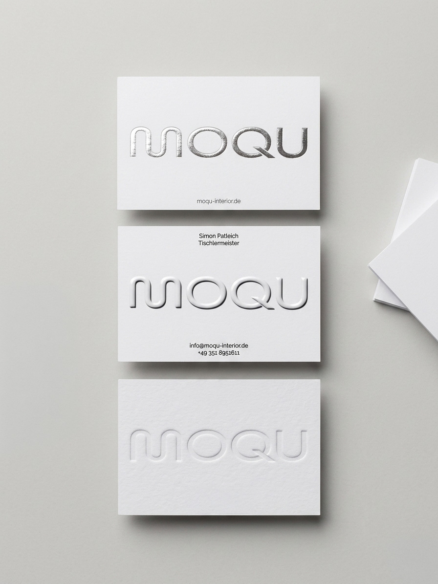
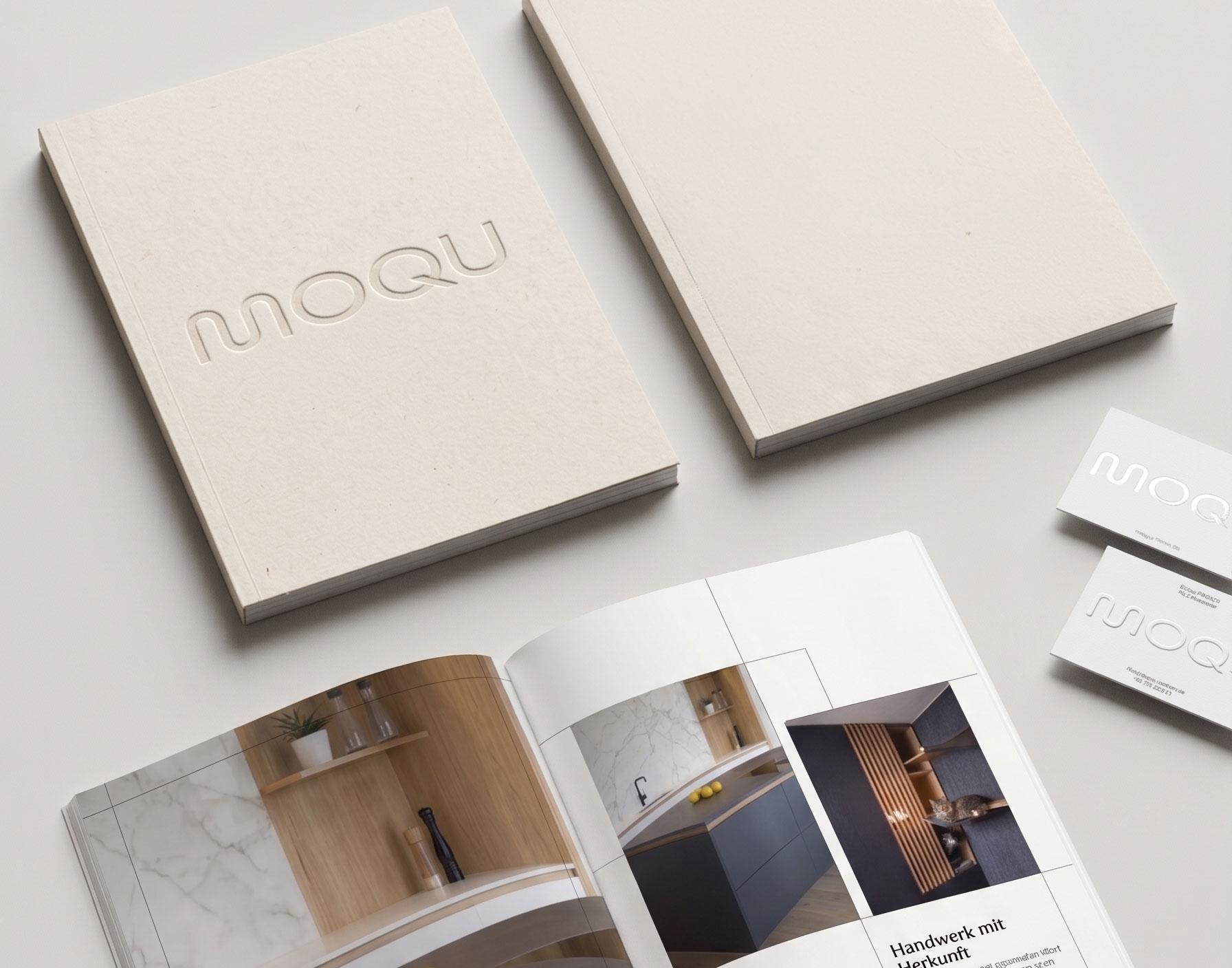
The current state of the identity covers logo and wordmark, typography (a two-typeface system pairing a refined serif for display with a contemporary sans-serif for body), a reduced colour palette tested directly against actual material samples from the workshop — oak, walnut, brushed brass, raw linen — so the brand sits in the same room as the product rather than competing with it, and an application logic developed with the full set of touchpoints in mind from day one (web first, but also signage, vehicle livery, business cards, invoice templates, print).
The full brand book is currently in active development. The version that goes into the client's hands will codify usage rules, type pairings, colour values, application examples across media, voice principles, and the storytelling framework as a single navigable document. For now, the system is documented in working files and applied consistently across the live touchpoints — the brand is in use even while the book that describes it is being written.
A brand that only works in one medium isn't a brand. It's a logo. MOQU is being built to work everywhere it eventually needs to.
The brand needed a story it could tell consistently across every touchpoint, in two minutes, in twenty seconds, or in a single sentence. I built that out as a tiered narrative system:
The single line. MOQU Interior — Tischlerei in zweiter Generation seit 1993, Moritzburg bei Dresden. This sentence appears verbatim across the site, in schema markup, in social bios, in email signatures. Repetition is part of how brand entities become legible — to humans and to search engines.
The short story. A 60–80 word version usable in About blocks, partner pitches, press contact. Father founded the workshop. Son runs it now. Continuity is the asset, not a footnote.
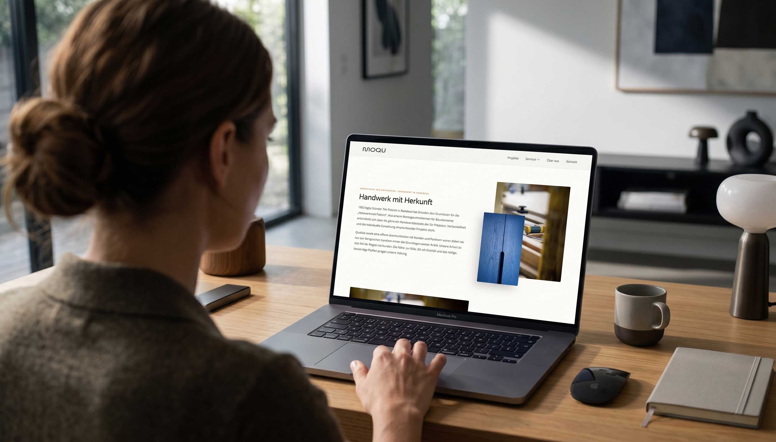
The full story. The longer narrative — the generational handover, what changed, what didn't, why MOQU is the brand name a workshop founded as Tischlerei Patleich now operates under. This version sits on the About page and feeds the press pitches.
The story isn't decoration. It's the spine the rest of the brand hangs from. Every piece of copy on the site, every job listing, every future Instagram caption can be traced back to a single position: modernes Handwerk mit traditionellen Wurzeln, in zweiter Generation.
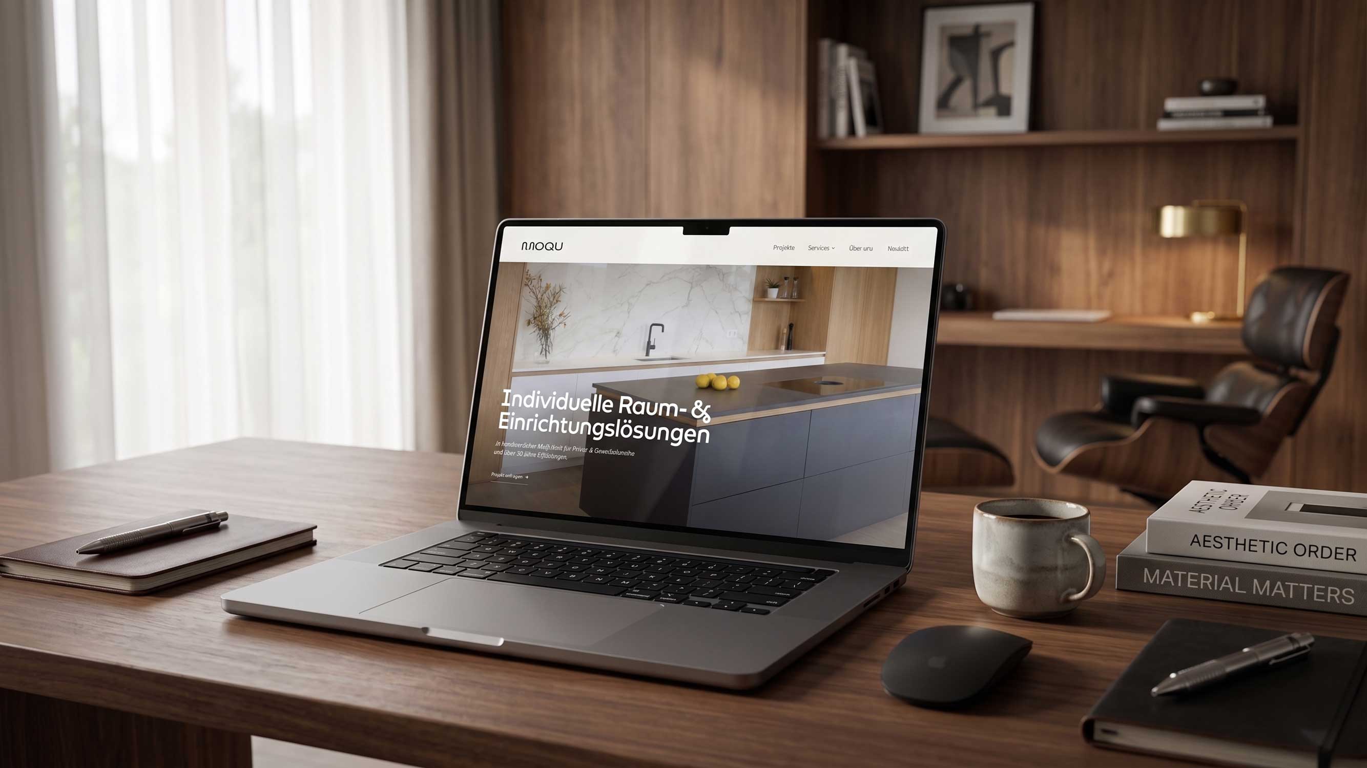
The site was designed in Figma and then hand-built in Shopify as code — Liquid, HTML, CSS and JavaScript, without dependency on a pre-made theme. Every layout, every component, every interaction is bespoke to the brand. This was a strategic decision, not a flex: when the entire brand thesis is modern hand on traditional material, a generic template would have undercut the proposition at the most visible touchpoint.
Structural decisions. The site is organised around three service pillars — Möbelbau, Innenausbau, Küchenbau — each with its own page, its own visual logic, its own FAQ block, and its own conversion path back to a contact form. The About page carries the family story. The Projekte page is the gallery. The career pages live as their own small system, with three open roles built out as full landing pages.
Visual logic. Generous whitespace, photography that gives material room to breathe, type set at sizes that respect reading rather than performing it. The hero on the homepage works as a single proposition rather than a slideshow of competing claims. The page rhythm — proposition, services, trust signals, projects, story, contact — was designed around how someone actually evaluates a carpentry: do they do my kind of work, do they do it well, who are they, how do I reach them.
Build approach. Building Shopify by hand instead of customising a theme means every element on the page is intentional. No carried-over default classes from a previous owner. No CSS bloat. No JS loading for features the site doesn't use. The structure is also clean for SEO and AEO purposes — semantic HTML, predictable schema injection points, fast load times, lean DOM. The site is a brand surface and a technical asset at the same time.
Material-first photography direction. Where existing photography existed, it was selected and treated to align with the new palette. Where new photography is needed, I built shot lists and visual references for the next workshop session — close-ups of joinery, hands at work, materials on the bench, finished pieces in context.
Every piece of text on the site is written from a single voice position:
The technical layer underneath the brand was designed in parallel, not bolted on afterwards.
Schema architecture. A full JSON-LD structure anchored on HomeAndConstructionBusiness as the canonical organisation node — with address, geo coordinates, opening hours, founding date, founder, area-served list, and a service catalogue cross-referencing the three service pages. On top: BreadcrumbList per subpage, dedicated Service schema per service page, FAQPage schema for the Möbelbau FAQs, JobPosting schema for the three career listings.
Meta data. Every page title and description in the site rewritten — primary keyword, location, value proposition, within character limits, written in language a human would also want to click on.
Local SEO. Dresden, Radebeul, Meißen, Coswig, Sachsen are present everywhere they belong — in schema, in titles, in copy, in alt text, in FAQ answers — without keyword-stuffing.
AEO logic. The site was built with answer engines (ChatGPT, Perplexity, Gemini, Google AI Overviews) in mind from the structural level up. Opening sentences are quotable. Named entities — Simon Patleich, Tilo Patleich, Meisterbetrieb, Moritzburg, 1993 — are repeated as a recognisable pattern across pages. FAQs sit in native HTML. The brand-line sentence repeats verbatim across surfaces. When someone asks an LLM "who builds custom furniture near Dresden", a site structured this way is far more likely to be one of the names that comes back.
Built into the code, not bolted on. Because the site is hand-coded rather than themed, the schema markup sits cleanly in the theme.liquid and per-template files where it belongs — not injected by a third-party app that might break with the next platform update. The validation work (Schema Markup Validator, Google's Rich Results Test) is part of the build process, not a separate phase.
MOQU is a living project, and the case study reflects that honestly. Several layers are in active development:
Brand book. The full document codifying the identity system — type pairings, colour values, application examples across media, voice principles, storytelling framework — is being written. The system is in use across live touchpoints; the book is the artefact that makes it transferable.
Social media system. The visual and editorial system for social is in design. It will live within the same brand grammar as the website — same type, same colour discipline, same voice. The format strategy is being built around what a workshop actually has to show: process, materials, finished pieces, the people, the place. Less "content marketing", more quiet documentation of good work. Platform mix and posting cadence are being defined alongside Simon so the system is sustainable for a small team to actually run.
Print and physical touchpoints. Business cards, vehicle livery, invoice templates, workshop signage — sketched, prioritised, scheduled for production as needs come up.
Photography library. Ongoing. The next workshop session adds to the library; the brand becomes more itself with every batch of new images.
I'll update this page as each layer goes live. A brand is not a deliverable. It's an instrument that gets played in for years.
A full brand build is rare to find in a single portfolio piece, and an ongoing one is rarer still. Most case studies present a frozen moment — we shipped, here's the campaign, the end. MOQU is the opposite: a brand that's being built and continuously extended, by one hand, over a long arc. For anyone evaluating this with a hiring or commissioning brief in mind, the project shows:
End-to-end brand ownership. Strategy, naming, identity, hand-coded web, voice, copy, SEO and AEO — designed as one connected system, not seven separate deliverables passed between three different rooms.
Naming work that holds up. MOQU is a name with room to grow. Not a clever pun, not a founder-name compromise. A brand asset.
Identity built around the product, not over it. Restraint was the brief. The brand doesn't compete with the work coming out of the workshop. It frames it.
Voice work that respects the brand. A second-generation Saxon carpentry doesn't need to sound like a startup. The voice maintains MOQU's actual character — serious, regional, modern but rooted — rather than imposing a generic "premium" voice from elsewhere.
Technical literacy as part of the brand stack. Hand-coding the Shopify site, building schema and AEO logic into the foundation, writing structured FAQs that work as content and as rich-result triggers — this is the work most agencies hand off to a developer who never read the brand brief. Doing it from one hand keeps the brand and the code in the same conversation.
Brand as a long arc, not a deliverable. The most honest signal in this case study is what's labelled as still in development. A brand is an instrument, not an artefact. The work continues.
Brand build: 2026 — ongoing. Brand strategy, naming, identity, hand-coded Shopify site, copy, schema architecture and brand voice by Charlotte Kliem. Brand book and social system: in active development. This case study will be updated as new layers go live.